Recover App
A case study on rethinking screen-time accountability.
01 Reframing the problem
I started Recover as a screen-time accountability app, where the goal was essentially to help users use their phones less. But I felt that positioning the experience around restriction made the product feel punitive. So I changed the core direction:
Instead of measuring what users should stop doing, measure what they want to accomplish. This shifted the product from screen-time reduction to intentional, focused time. The progress ring became something users worked toward, the leaderboard celebrated productivity, and social interactions became encouragement rather than warnings.
02 Making focus social
The main opportunity I saw was that most productivity tools treat focus as a solo activity.
I wanted Recover to recreate the feeling of being surrounded by people who are also putting in the work. That became the foundation for the social experience.
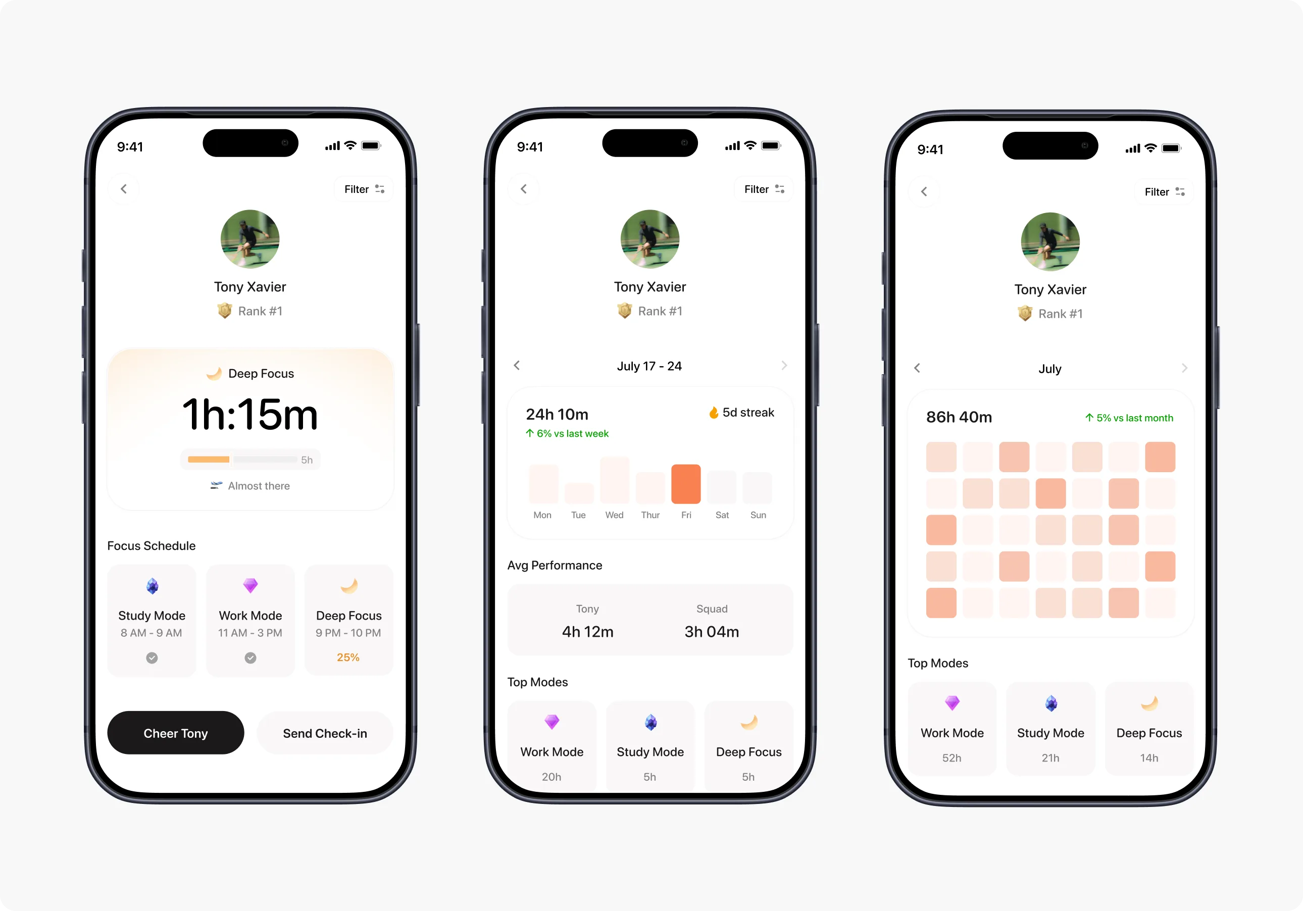
Instead of simply comparing screen time, users could see their friends' activity, celebrate progress, send encouragement, and check in when someone fell off track. This led me to design the product around positive accountability rather than shame or restriction.
03 Building around Modes
I wanted the experience to adapt to what the user is trying to accomplish, rather than treating every focus session the same.
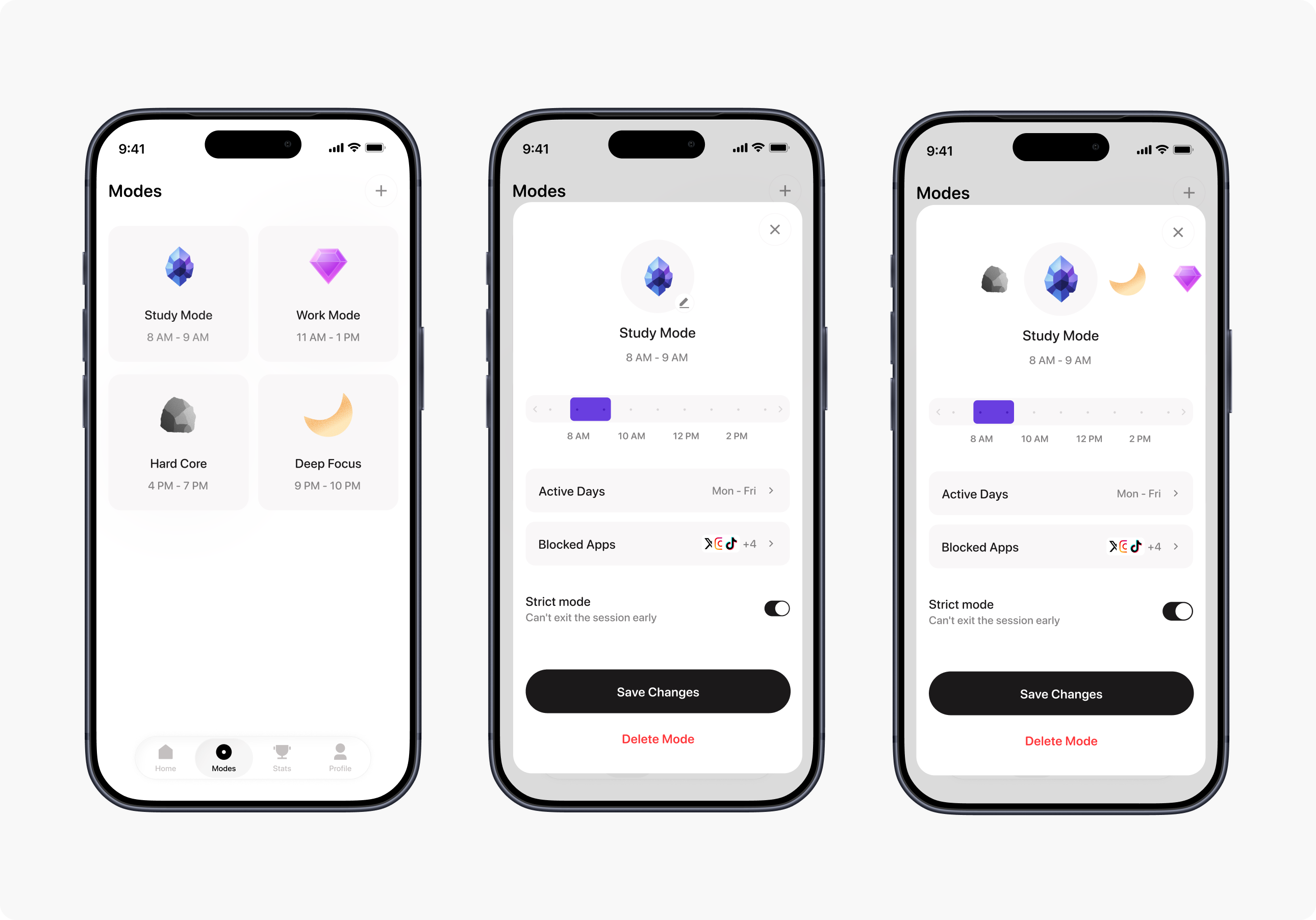
So I introduced Modes such as:
- Study
- Work
- Deep Focus
- Hard Core
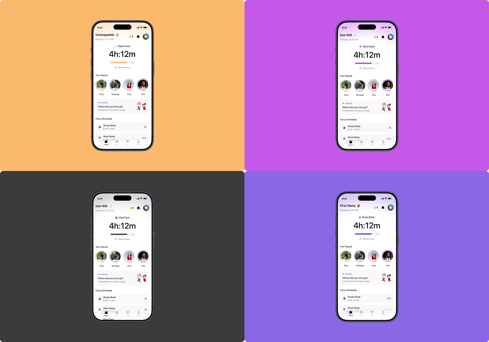
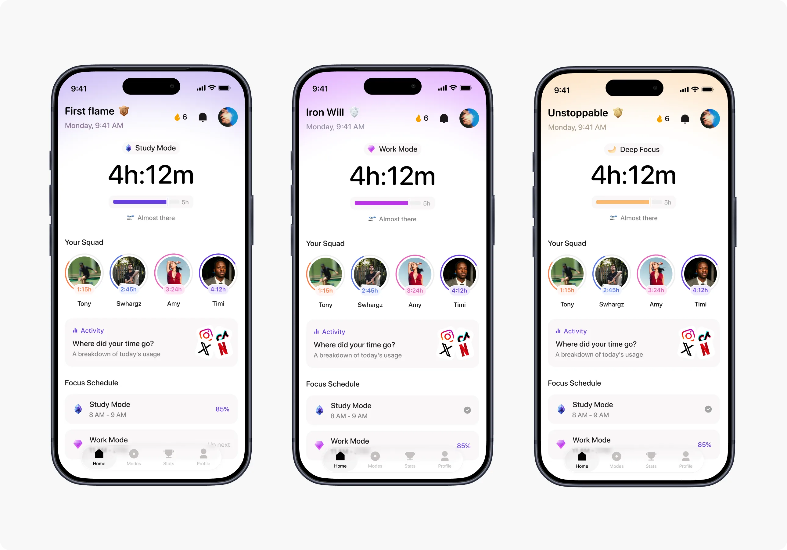
Each Mode became more than a label. I used them to influence the visual experience, giving each one its own color treatment and mineral-inspired icon. This allowed the interface to feel more alive while giving users a clear sense of what they were currently working toward.
04 Turning productivity into progression
I didn't want Recover to feel like another utility that simply reports statistics.
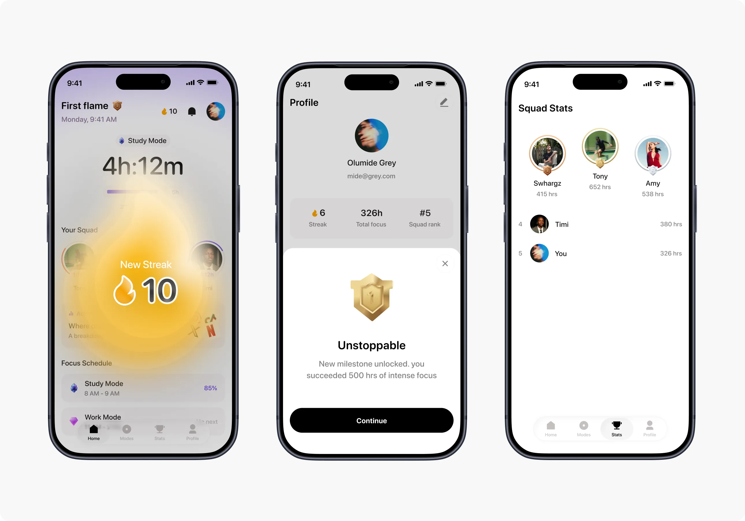
I introduced a layer of gamification around the user's effort: XP, ranks, badges, gems, streaks, and a podium-style leaderboard. Even the header became part of the progression system, with rank titles such as “First Flame” and “Iron Will” replacing a generic greeting.
The goal was to make focused time feel like something users were building, rather than something they were simply tracking.
05 Designing the social interactions around intent
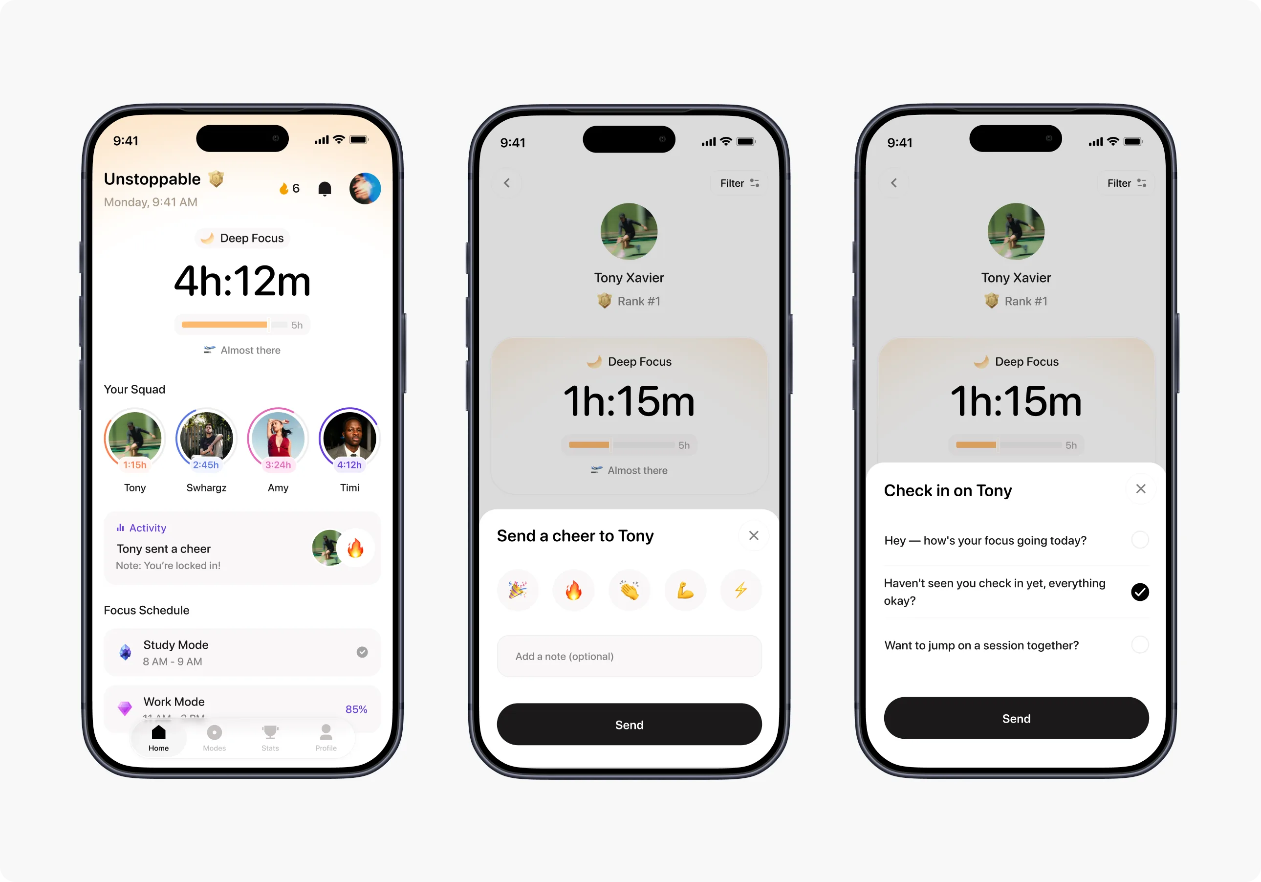
As I worked through the social experience, I realized that different actions needed to communicate different intentions.
For cheer, you're basically saying “I see you. Keep going.”
For check in, what you're saying is “I noticed you've gone quiet. Are you okay?”
That distinction led to different interaction patterns: Cheer became a lightweight reaction system, while Check-in became a more conversational flow with preset prompts.
07 Designing the onboarding around personalization
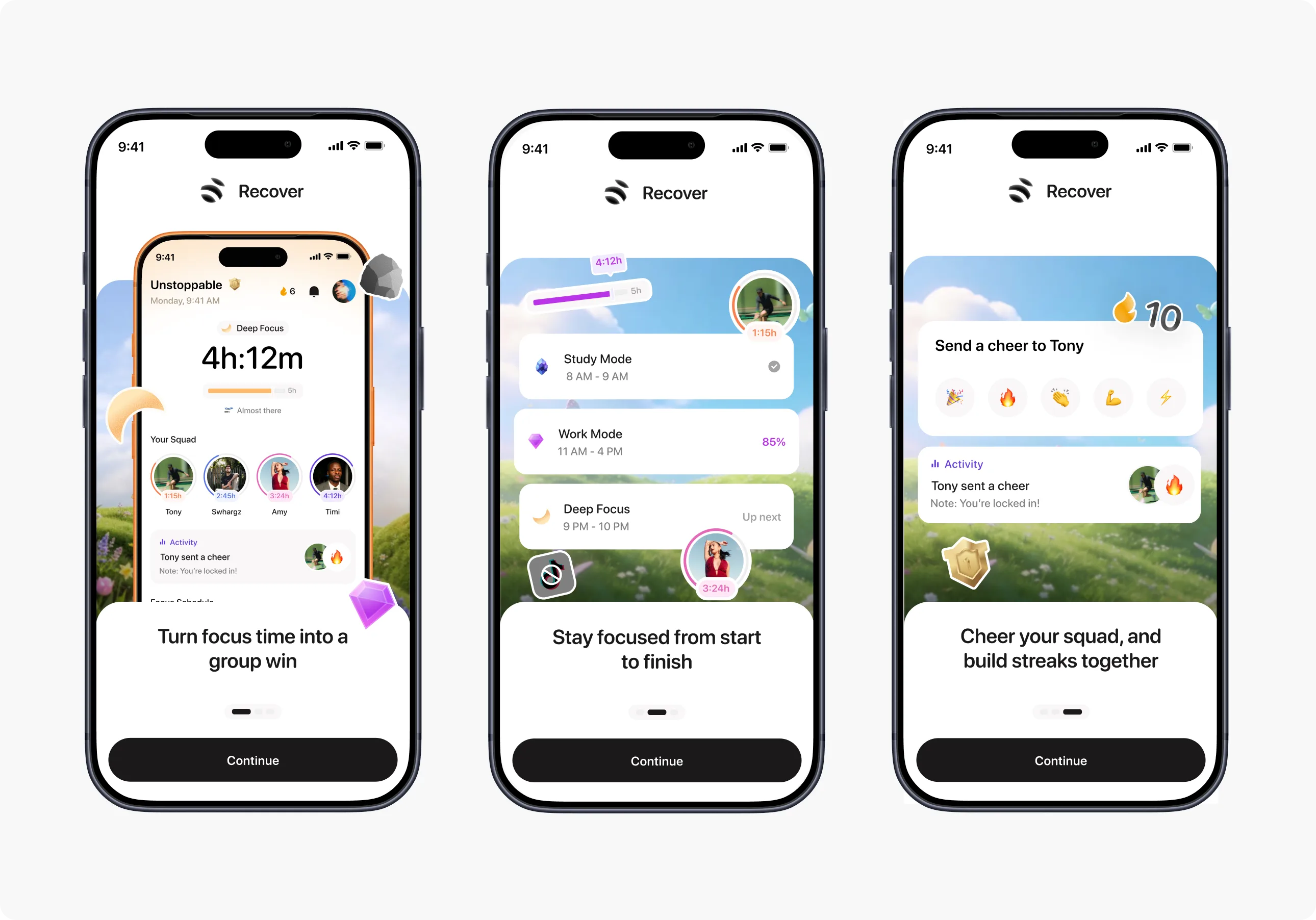
The initial onboarding collected information such as age, occupation, and screen time, but I realized some of those questions weren't actually contributing to the experience. So I redesigned the flow around information that could directly influence the user's experience.
The onboarding now moves toward understanding the user's screen-time behavior, establishing a focus goal, setting up permissions properly, and getting them into their first social experience. I also addressed practical UX issues such as the Apple sign-in requirement, permission education, declined-permission states, and continuity in the squad invitation flow.
The overall design philosophy
If I had to condense the entire direction into one statement for your case study, I'd say:
I wanted Recover to move the conversation from “How do I use my phone less?” to “What can I accomplish with the time I get back?”
That meant shifting the product from restriction to progress, from solo productivity to social accountability, and from passive screen-time tracking to an experience that makes focused time feel rewarding. That, to me, is the actual design story of Recover. It makes you sound like the person who shaped the product direction—not someone who simply designed a collection of screens.